The beautiful thing about thinking about brand awareness from an early stage is that it forms a flywheel that slowly but surely pays dividends the deeper you get into a project’s construction phase.
By that, I mean you have the advantage of “time” when you begin activating, announcing, and waving the flag for your property early – from day one.
Perhaps unsurprisingly, I still hop on phone calls with groups that have had it engrained that “pre-leasing begins 2 months out” from occupancy.
Every single time, without fail, I cringe when I hear that phrase hit the air. The hardest part is the unlearning, and often times it’s a fruitless battle with groups that can’t see it any other way.
That’s OK, though, because it presents an opportunity to show and tell ways to approach preleasing differently.
The core of our thesis at Authentic has always been that it’s less about leasing and more about awareness from the jump.
Making future renters aware of what is coming builds a groundswell of support in a way that flipping a “leasing switch” cannot, and will never, accomplish in the same way. Especially 2 months from the doors opening.
Let’s dive into a few simple tactics that can help activate your property and get you ahead of the game very early on.
One of my favorite onsite reports from a partner in recent months has been from the team at One West Drive.
We got their early brand awareness rolled out before the Memorial Day Holiday, resulting in a significant initial splash in the local market. To the tune of over 30 immediate inquiries, to be specific.
Before I go any further, let me address any naysayers already grumbling. 😏
“Inquiries? Those aren’t leases.”
You’re right; they’re not leases. But they're 30+ conversations the team is already having about the property, months and months ahead of leasing, that will only grow and morph and evolve as the building comes to life.
And hey, that’s the point!
When you begin building a dialogue with the community well before anything’s there, you build a core group of renters ready to sign before leasing begins.
When we think about activating a property, it’s all about bringing the brand to life onsite. And it doesn’t need to be fancy or over the top.
However, it does need to be thoughtful and unique to the brand. Don’t put your onsite decisions in the hands of local sign shops!

Think about using what’s already available to activate.
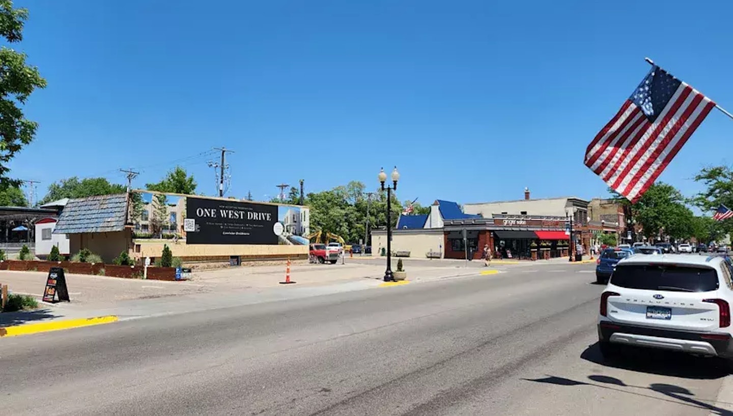
Sometimes we build solutions around existing structures, old buildings, fencing, and even facades that face the street.
If all you have are construction fences, that works, too. But get creative if you can and liven up even the most “boring” assets.
In the example above, we’re leveraging an old building to display a large banner along a main thoroughfare. Not complicated.
Believe it or not, I’ve seen property marketing with (literally) no information. A few fancy stock photos, patterns in the background, and the project's name. It looks fantastic and exciting, yes, but there’s no info. It’s so frustrating.
Are they apartments? Townhomes? Offices?
Will they be available anytime soon?
What can I expect?

The amount of information onsite will depend on the property and various factors (visibility, walkability, etc.), but we always suggest providing enough information to encourage deeper investigation.
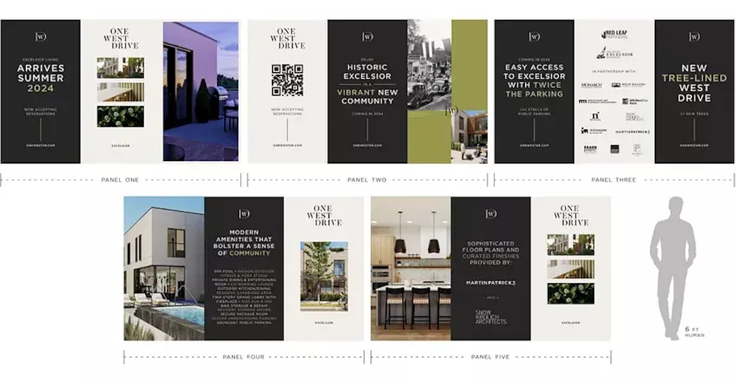
For example, with OWD we designed human-sized fence wraps that provide more insight into the look and feel of the brand and building, the vision for the space, and a few notes on what’s coming.
It allows locals and visitors to casually stroll the property, gather information at their own pace, and dig deeper. We are sure to provide information on delivery timelines and the types of availabilities locals can expect, too.
This should be reasonably low-hanging fruit, but for many groups, these simple items are always overlooked with onsite activations.
When you capture someone’s attention, tell them where to go or who to call. Make it clear and make it simple!
If your property is out of reach for walkability for one reason or another, make your activations big, bold, and super clear.
For example, I remember a property under construction along I-25 in Denver that leveraged a large banner that faced the highway. Enough information, but not too much when considering cars in traffic slowly passing by with only enough time to remember a web address on their daily commute each day.
Simple. Smart.

For our OWD project, we kept the roadside banner large and clear. We answered three important questions:
The brand is the umbrella, the photography frames the information, and the rest is neatly organized for consumption.
A perk of this location is that it’s a little slower-paced, and cars aren’t flying by at interstate speeds. It’s also a nice walkable area that will capture foot traffic week after week. A slow drip, of sorts.
It’s an absolute must to have a splash site up and running before onsite activations occur. Ultimately, the website is usually the first destination for sleuthing.
Think about it. What would you do?
Seek a phone number and try to call someone immediately, or check out a website and give everything an initial sniff test?

The website is another branded extension and an additional opportunity to build on the brand experience you’ve started at the property.
Consistency matters here, so be sure that language, design, and messaging align across mediums.
Use the splash website to begin pulling inquiries and slowly build a contact list that you can begin to nurture in the months ahead.
Tease visuals, reveal details in time, and continue to build on the vision of the property until you are ready to launch the “full” website with floorplans and further leasing details.
I think activating your property brand as early as possible drives better outcomes. Our team collectively sees it every month, and our client partners follow up with similar feedback.
If you find yourself stuck in a system with an old-school mentality, I encourage you to push for change. If you are in a group already pushing these methods, keep going!
I’m also curious about what is and is not working for you, so don’t hesitate to drop me a note and let me know what hits.
Happy activating!

Discover why boutique multifamily buildings outperform their larger competitors by focusing on curated experiences, intentional design, and emotionally resonant branding.

Discover how data-driven branding strategies can accelerate leasing, boost NOI, and turn your multifamily property's identity into a measurable performance asset.

Your brand’s reputation is built—or broken—at the leasing desk. Are you ready to unify leasing and marketing to protect it?

Remember when we all DIY dip-dyed our hair in Kool-aide and learned just because you can do it yourself doesn't mean you should? This week we're digging into the hidden costs of DIY'd branding.
A simple read in under 5 minutes, delivered to your inbox Saturday mornings.
A simple read in under 5 minutes, delivered to your inbox Saturday mornings.