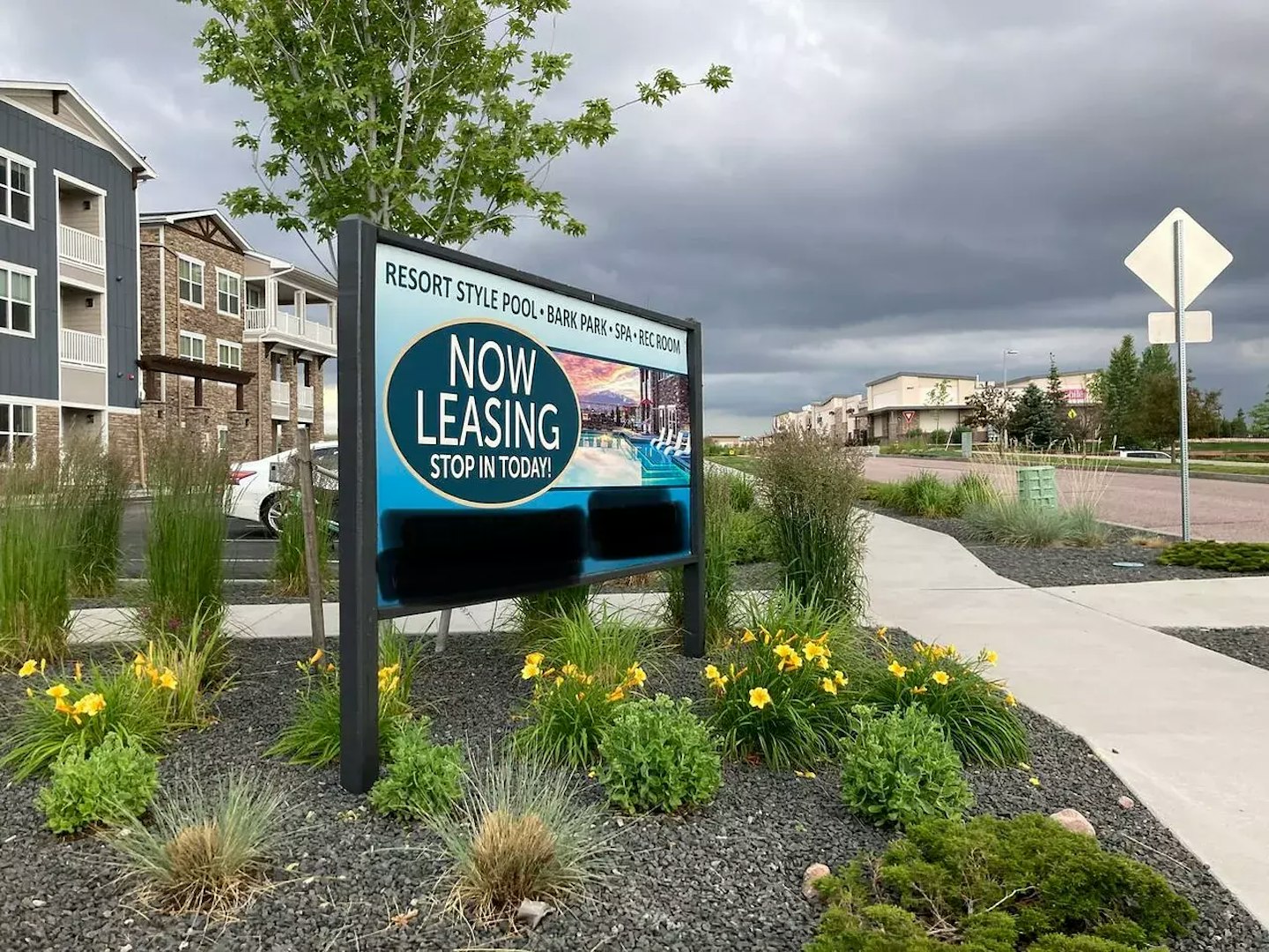
Last week, I was visiting Target with my son to pick up a few household items (and to scan the toy section) when I spotted this sign across the street.
One of my favorite things to do is observe what the multifamily world is doing when it comes to all things marketing, so on the way out, I snapped this photo.
Honest question: does this pull people to a leasing office?
Or does it just check a "marketing" box?
Beyond the lack of brand alignment and overall style of the sign, I noted in my original share on LinkedIn that I saw a few issues:

The fascinating thing is, the property is very well maintained as far as I can tell.
Excellent paint, outstanding landscaping, and so forth. Of course, I haven’t stepped into any of the units, but outside appearances are generally welcoming.
But I wish this sign wasn’t so… busy and stock photo-y.
In my humble opinion, signage is a lighthouse for the experience that lies beyond.
Even if signage says “nothing” and serves a strictly tactical purpose, a sign sets the stage for the experience.
It should connect directly to your brand and lead with intention rather than confuse, distract, or lose focus of the property.
It’s one thing for me to make observations, but I love gathering input from the greater multifamily community.
In response, I saw many good ideas and suggestions come forward.
These constructive criticisms help us all make better decisions moving forward as opposed to tearing down a decision someone, somewhere, ultimately made.
Rooftop amenities practitioner Brandon Reed spoke to high-level intent:
In my opinion and experience, and as one of the first impressions of the property signage should convey and relate to the theme and story of the project and should give you a sense of what's to come. It should be a "sign" of the story that the potential tenants will get to be part of should they choose to live here and it should be a clear distinction from one property to another...
Marketing Director Wendy Coplan suggested getting tactical:
IMO strong branding and trackable vanity URL are key. An alternative would be the logo lockup and trackable QR code. Is anyone going to remember the phone number from this vantage point?
Property Marketing Director Sean Skinner spoke to synergy:
There should always be a synergy between your brand and the brick and mortar building (architecture/interior design etc.). If not your missing an opportunity to truly engage and just checking a box.
Another marketing mind, Renne McIntyre, sees too much:
Way too busy for someone driving by. I prefer one visual statement with cohesive branding to drive a prospect to want to learn more.
It’s no secret that signage can be challenging.
Combining an on-brand aesthetic with meaningful action items and a total package that inspires someone to stop and look (let alone take said action) is a tall order.
If it were easy, we’d have beautiful signs at every property both upfront and throughout a campus or community.
Thankfully, we can learn from what works well and feels right – and what doesn’t.
A few of my biggest takeaways from my experience and via the greater multifamily community are relatively simple:
You’ll see me speaking to brands quite often, and this is no exception. Brand cohesion matters and will always matter. Aligning all you do with your brand makes for a more cohesive experience for the end user.
Too much of anything is usually bad, and clarity is king in the case of signage. In the case of a leasing sign, make it clear to the viewer what to do: call, email, visit the website, scan a code, or something else. Don’t give four options. Give them the one or two options that will most directly show action being taken.
If everything is luxury, nothing is luxury. Fact. Find ways to speak to your offering without the standard language we see commonly doled out day after day within the industry. I get it - some words are unavailable - but try harder!
This seems obvious, and yet it’s very commonly missed. What makes your property exciting and worthwhile? Hint: your top five amenities aren’t the answer. Maybe it’s location, proximity, a unique local scene, access to things, etc. Build on what makes your spot a destination.
Ultimately, a few simple guiding principles will make your next signage package a bit more pleasant (and successful) for your audience.

Discover why boutique multifamily buildings outperform their larger competitors by focusing on curated experiences, intentional design, and emotionally resonant branding.

Discover how data-driven branding strategies can accelerate leasing, boost NOI, and turn your multifamily property's identity into a measurable performance asset.

Your brand’s reputation is built—or broken—at the leasing desk. Are you ready to unify leasing and marketing to protect it?

Remember when we all DIY dip-dyed our hair in Kool-aide and learned just because you can do it yourself doesn't mean you should? This week we're digging into the hidden costs of DIY'd branding.
A simple read in under 5 minutes, delivered to your inbox Saturday mornings.
A simple read in under 5 minutes, delivered to your inbox Saturday mornings.