Over the last many months, I’ve observed website announcements across the multifamily industry. Each time, I see how different groups are approaching digital these days, specifically on mobile.
There’s a lot of good out there, to be sure.
But, there are also very concerning UX trends with many others.
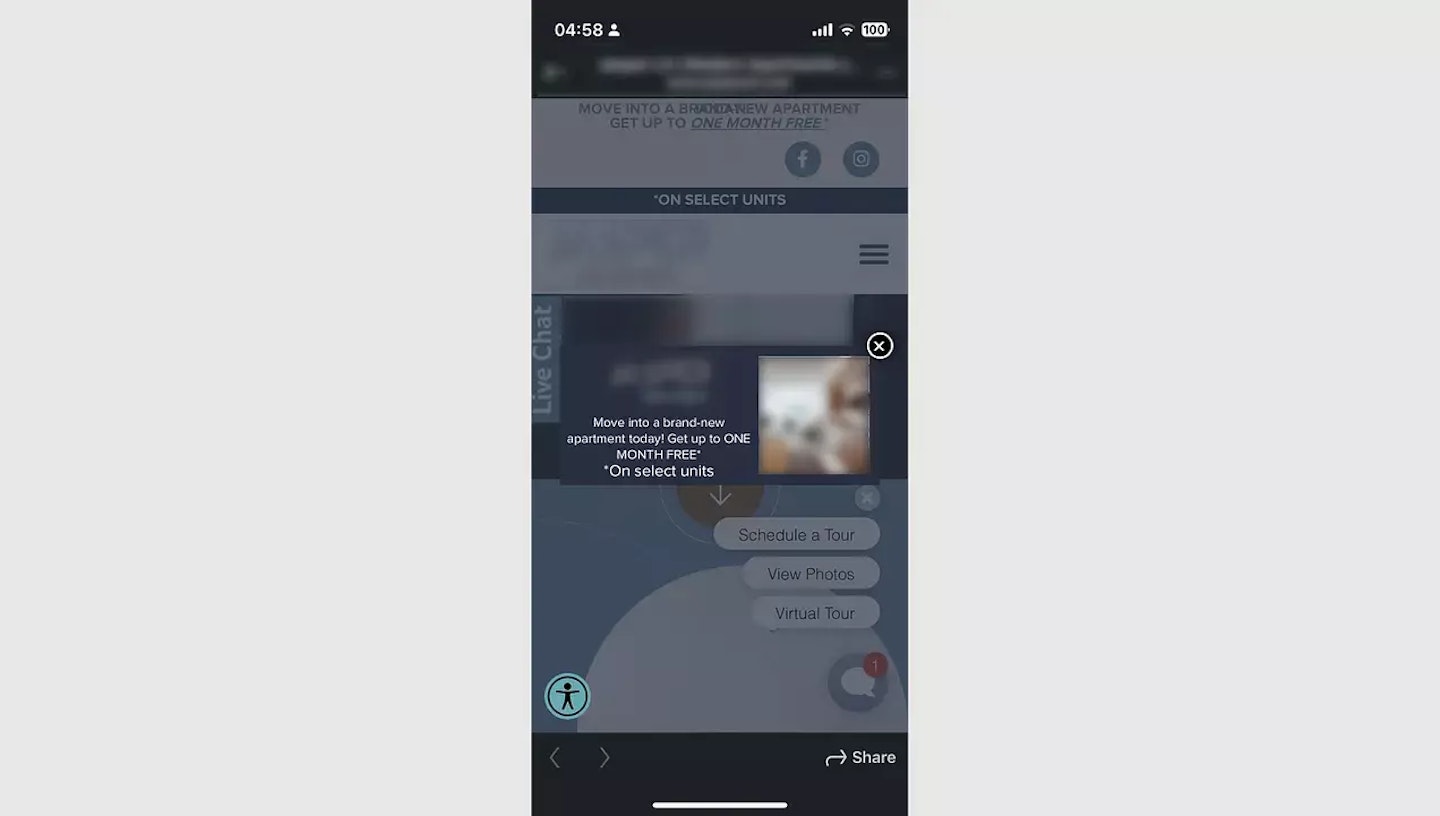
When I pull up websites in the latter category on my mobile device, I see not one, not two, not three, but up to six "things" I'm forced to filter out.
Six!
Look at the blurred example above (used merely as a reference point for the trend I’ve seen weekly at this point).
Pathways to information and accessibility are essential topics, of course.
But do we need three options to chat?
You hate to see brands fall apart on the web, especially when most initial touch points are on our mobile devices today.
It’s the responsibility of a creative web partner to build a better experience - not one that ends up being frustrating to use.
In my case, I don’t have the largest phone on the market, but it’s not the smallest, either.
Why is the experience so painful?
The industry norms that have become commonplace today tend to include an over-reliance on widgets, plugins, iframes, and other cheeky ways to draw in a visitor’s attention.
But here’s the problem: when everything is vying for attention, nothing gets attention.
When I see a site like this, I’m immediately overwhelmed by the sheer number of options. I forget I’m on a property website and find myself frustrated with the pushiness of the experience.
The buttons that pop up everywhere.
An experience that quickly feels out of balance and forced.
Most importantly, I sense the lack of care for me as a person and a future renter.
At the same time, it makes sense (high level, at least) why this is so common on property websites.
Teams are pressed to sign leases fast, and if their digital platforms offer six different ways to get a visitor’s attention, why not activate everything?
Understandably, marketers want to unleash all the bells and whistles because they think it will equal more leads.
But does it?
I would argue it does the opposite.
In an industry already trying to integrate platforms A through Z, the last thing we need is to further muddy the waters with an overindulgence of bolt-on widgets and lead-gen tactics once the renter is already there.
Of course, it’s one thing to say these things and another to suggest a better way forward.
In my mind, a few fundamental north stars would help clean up this type of example to offer a more straightforward path to understanding what the property is all about while letting the renter do the driving.
Stick to a single banner or popup that surfaces after a few seconds of browsing, for example, instead of various messages at once.
If I can’t read the website text or gain context from a few images before being pummeled with information, I’m lost before we’ve gotten anywhere. Get me to buy in and then sell to me!
Chat prompts, lists, and icons clutter a mobile experience, so I would never recommend pushing chat three ways – especially on mobile. Give me an option, one option, but no one needs three.
Another thought we could file under “2b” is that chat becomes useless if it’s only a contact form outside of an hour a day. If it’s not chat, take it off.
Remember, when everything is vying for attention, nothing gets attention.
For example, stop showing a monthly promotion in a sticky banner, popup modal window, promotions widget, and within the website content.
Renters get it - you have promos and want to sign leases.
If a prospective renter can’t even get to the details of what you’re selling without closing out a handful of things in the way, well, there’s a major problem.
When these sites feel like Times Square billboards instead of a well-curated property website, leases will disappear. Be smart with user experience.
Give options, but don’t load up the boat.
Let your visitors row around and find their way.
Allow them to test the waters, offering a few simple nudges that let them know you’ll be there when they’re ready.
🚣

Discover why boutique multifamily buildings outperform their larger competitors by focusing on curated experiences, intentional design, and emotionally resonant branding.

Discover how data-driven branding strategies can accelerate leasing, boost NOI, and turn your multifamily property's identity into a measurable performance asset.

Your brand’s reputation is built—or broken—at the leasing desk. Are you ready to unify leasing and marketing to protect it?

Remember when we all DIY dip-dyed our hair in Kool-aide and learned just because you can do it yourself doesn't mean you should? This week we're digging into the hidden costs of DIY'd branding.
A simple read in under 5 minutes, delivered to your inbox Saturday mornings.
A simple read in under 5 minutes, delivered to your inbox Saturday mornings.