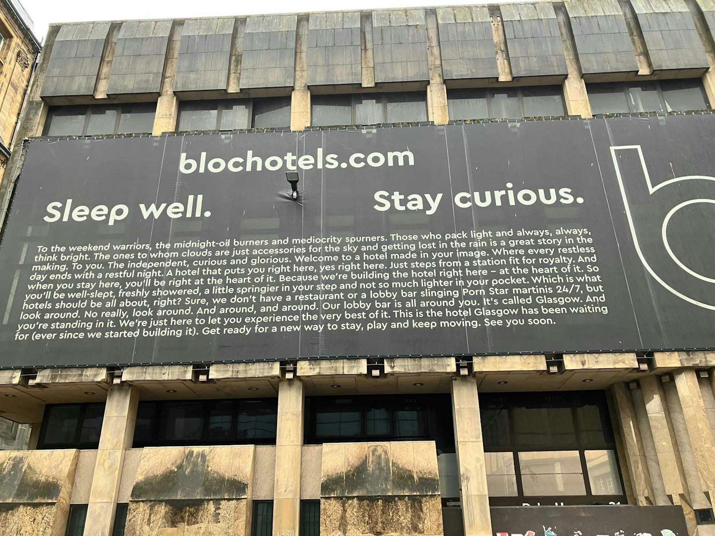
I’m fascinated by onsite signage, especially during the current real estate season when all are pushing for a deep emphasis on ROI, audience capture, and conversions. It makes sense.
To that end, “the sign” says a lot about where the property’s head is.
What do I mean?
Take a look around your city this weekend. What are the signs saying? What new projects are positioning themselves for success in the future?
What properties have zero indication of what they are, when they’ll open, or how to find additional information?
My guess is you’ll see both in the wild.
One of our team members at Authentic shared this (above) example, and it had me thinking about a few pros and cons we can take into our multifamily work.
For the sake of this 5 minutes or less exercise, let’s review a few key buckets:
Right away, I enjoy the stark nature of the sign. I have to imagine it’s not for everyone, but that’s… kind of the point.
It should be for the audience you want and expect.
Hard-working, semi-brutalist design, with just white text on a black background. It stands as a decisive, flag-planting piece that leans into minimalism.
When I visit the website, I can’t say I feel a direct connection outside of the brand identity, so in that sense, the next step in the journey misses the mark for me a bit when it comes to brand experience.
The layout is another story.
Let me quickly ask: did you read the entire thing?
Me either.
I’ve had this image for days and days, and still, I have no interest in reading it all.
The sign is massive, so the text is large in person, but still, beyond turning heads, I don’t see the layout as something successful outside of the foot traffic that stops for a full 60-second read.
Is that a risk worth taking?
The tension in this sign, for me, lies in the language.
I strongly feel there is too much language here–many headlines that get to feeling disjointed–but much of the writing is well done.
It’s fun, quirky, relatable, and has me envisioning what it would be like to stay there while exploring all Glasgow offers.
It could be my home base to get clean, rest my head, and not be out thousands of dollars a night while I explore the city.
By the way, I have a confession to make.
I finally just finished reading the entire sign as I forced myself to focus on the messaging.
But I never would have unless I were writing a quick case study.
Again, I ask, would you?
In the multifamily world, what to do next is paramount.
It’s the thesis behind the “renter journey” and all of the bits and pieces that go along with it and what that means in practice for groups across the board.
If I’m walking or cruising by in the car, tell me what to do:
This sign misses that target.
One might argue this example is hospitality-focused and thus needs to be more flash than substance, and I wouldn’t entirely disagree.
Plus, it’s smack in the middle of a primary metro market, so it will likely have no trouble getting heads in beds when it finally does open.
But that makes a point I often mention about your projects: they’re not in downtown [major city name here].
They’re in an up-and-coming neighborhood.
They’re surrounded by competitors.
They’re unknown in the market.
Multifamily can’t bank on the no-or-limited signage move when activating a property. It simply won’t work.
Regarding signage, think about your renter first and then what you want your renter to do second.
The brand can evolve from those thoughts, but ignoring either will lead to a fancy sign without a clear next step.
And with the state of renting today, you want a clear next step.

Discover why boutique multifamily buildings outperform their larger competitors by focusing on curated experiences, intentional design, and emotionally resonant branding.

Discover how data-driven branding strategies can accelerate leasing, boost NOI, and turn your multifamily property's identity into a measurable performance asset.

Your brand’s reputation is built—or broken—at the leasing desk. Are you ready to unify leasing and marketing to protect it?

Remember when we all DIY dip-dyed our hair in Kool-aide and learned just because you can do it yourself doesn't mean you should? This week we're digging into the hidden costs of DIY'd branding.
A simple read in under 5 minutes, delivered to your inbox Saturday mornings.
A simple read in under 5 minutes, delivered to your inbox Saturday mornings.